Everon's support team kept charging stations running — but worked from a static list that told them almost nothing. I redesigned station management into a live dashboard built around how they actually diagnose and fix problems.
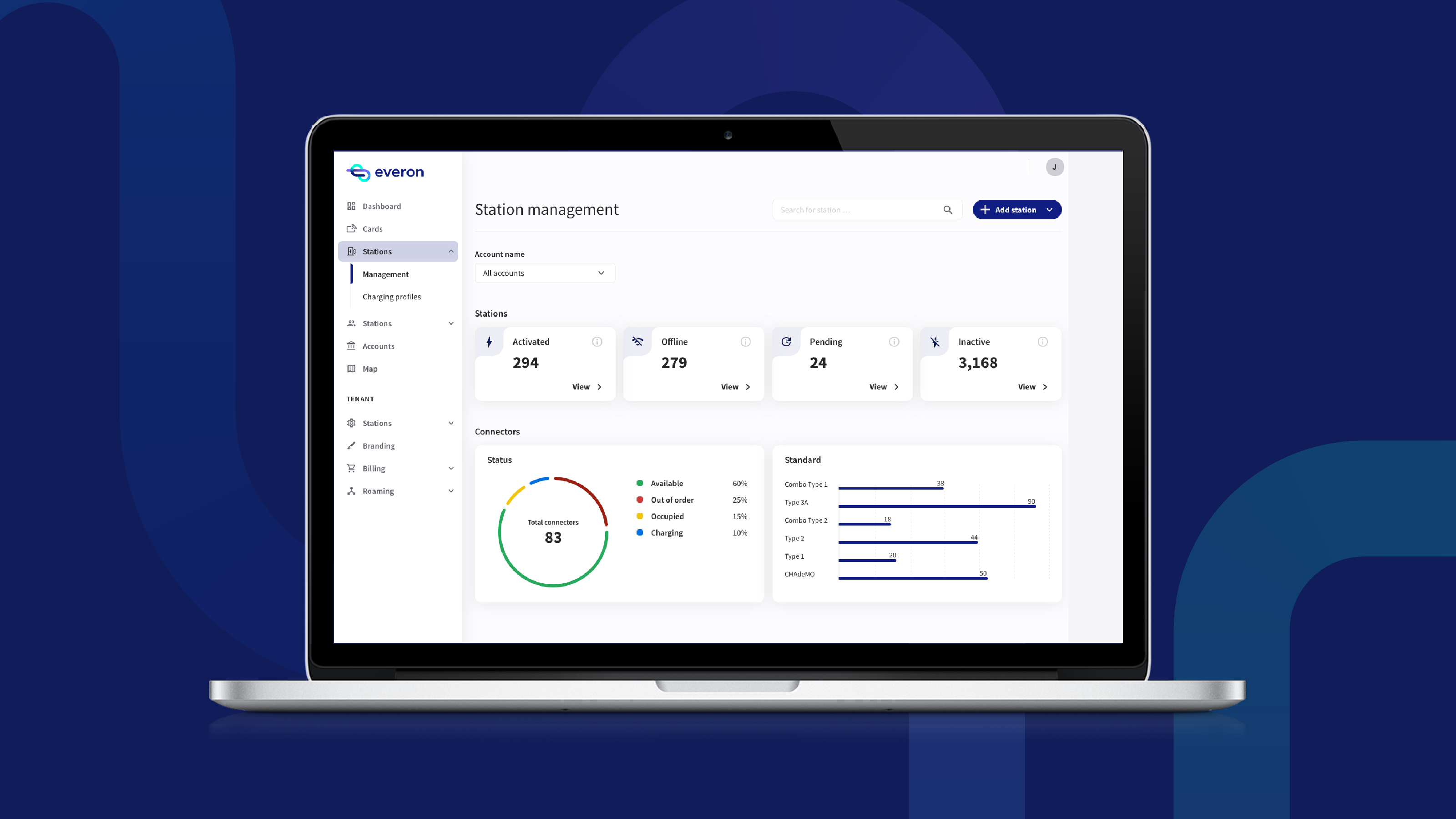
When a charging station breaks, every offline hour costs the operator money.
But Everon's support team worked from a static list of stations — no status, no errors, no next steps. Diagnosing a single fault meant digging through logs.
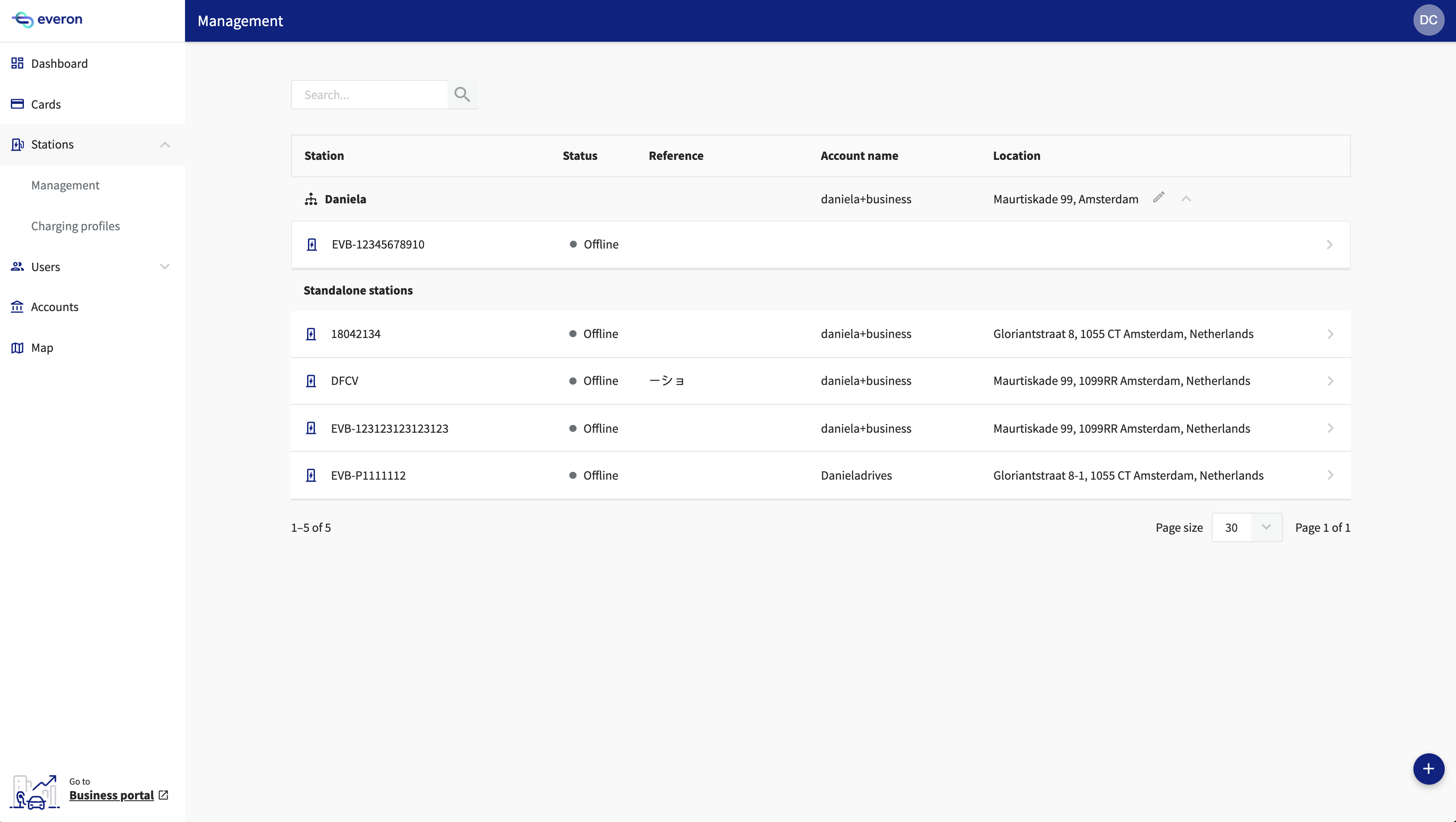
Before — the previous station management page: a flat list with a status label, and no actionable insight.
Help the support team gather a station's data in an easier way?
Enable support to identify and solve station problems faster?
Increase efficiency in the support team's workflow?
Help support be proactive instead of reactive?
Before building anything, I got clear on the user and the key jobs and pain points to address, using three methods.

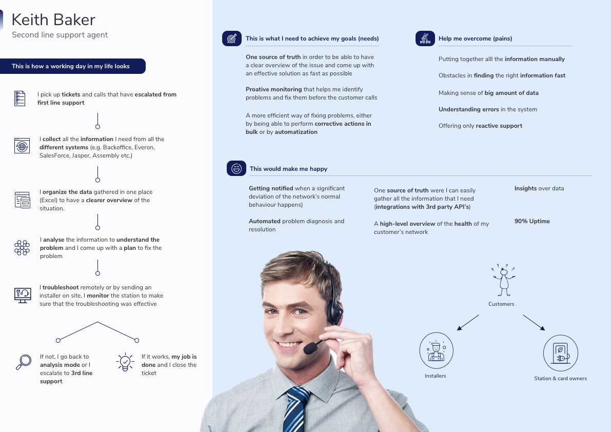
Our key user had no proper research or documentation. I built a persona alongside the job map to anchor this initiative — and future ones.
Using a prioritisation matrix built with key stakeholders, we narrowed a long list of ideas down to three bets.
I tested a high-fidelity prototype with five support agents in moderated sessions — and fixed what failed before a line of code was written.
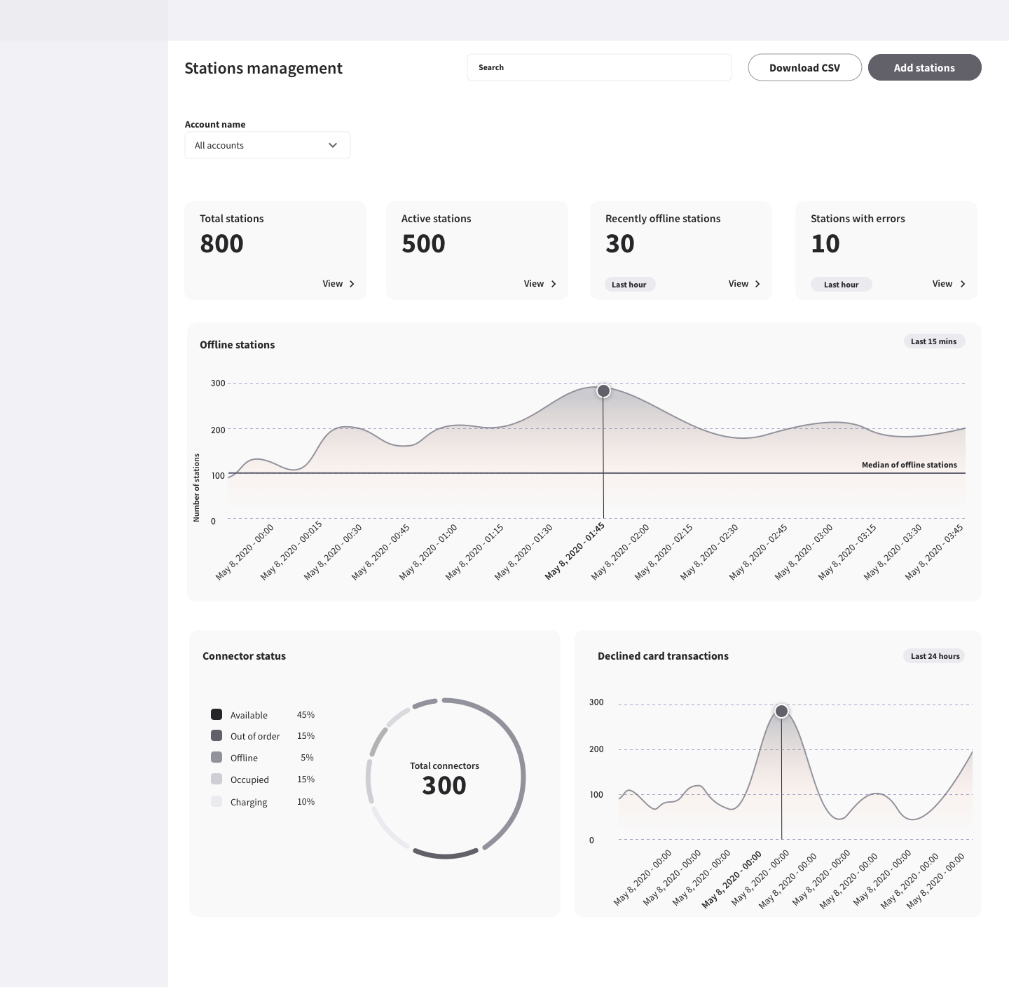
“I wouldn't really look at declined card transactions here — that graph doesn't help me solve anything.”Support agent · session 2
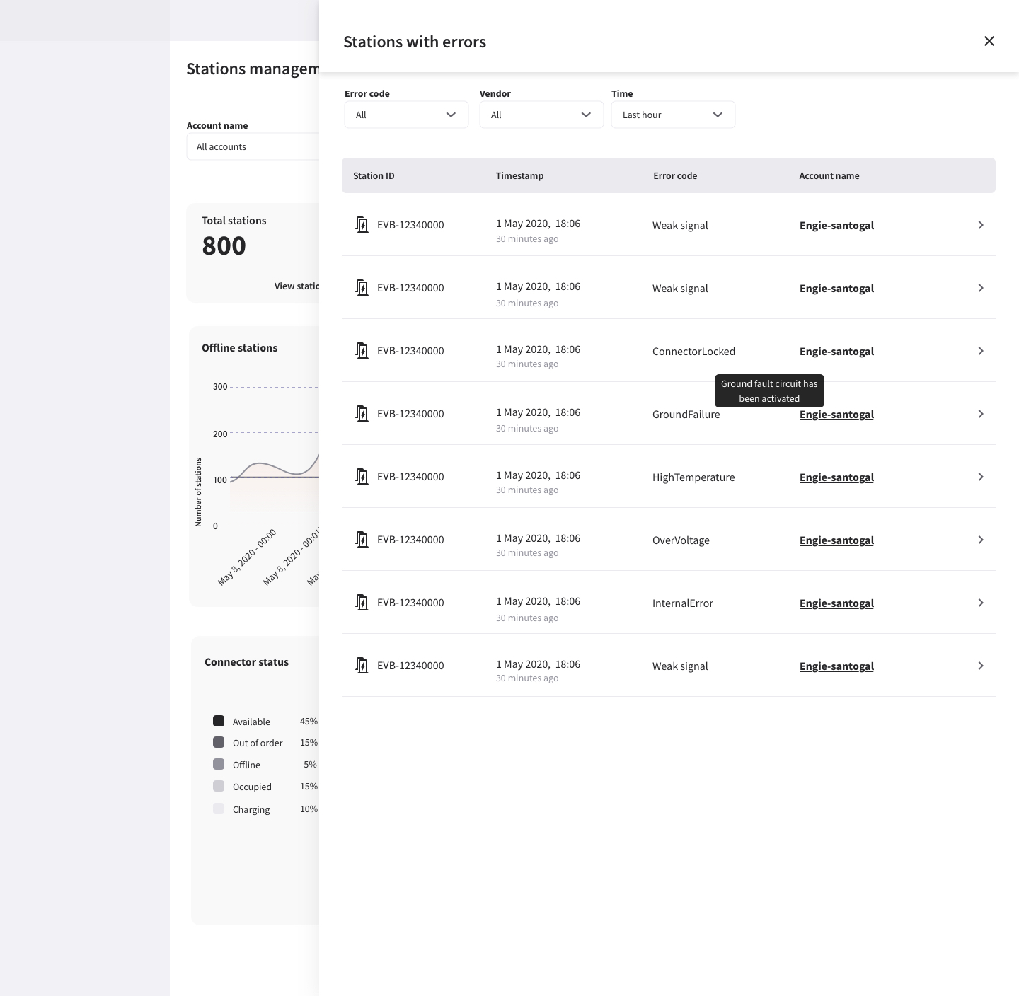
“OK, I can see the error name… but then what? I still don't know what my next step is.”Support agent · session 4
Both findings went straight into the next round: the declined-transactions graph made way for more actionable content, and every error now pairs its name with a plain-language description and the concrete steps to resolve it.
“Wow, this is exactly what we need — seeing the code, the suggested actions, and being able to reset the station straight away. This is perfect.”Support agent · follow-up session
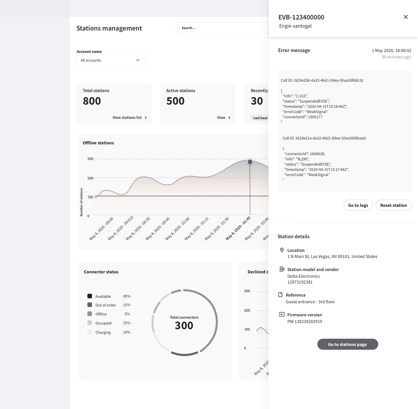
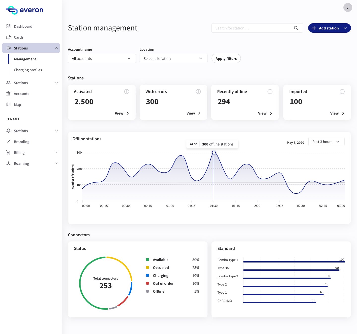
The validated design hit reality: the error-diagnosis engine needed backend work the team couldn't afford, and priorities shifted mid-quarter.
I had to compromise — sometimes against my own convictions. We cut the scope to an MVP: error management was dropped, three features survived. My job became making those three as good as possible with what we had.


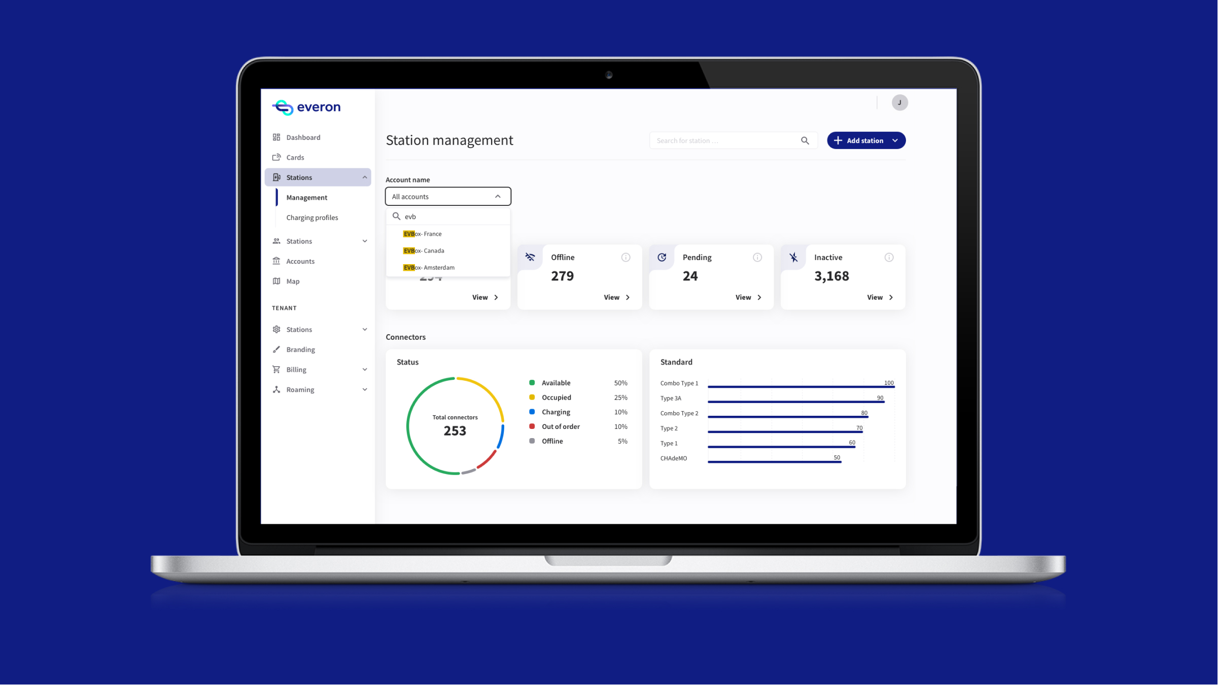
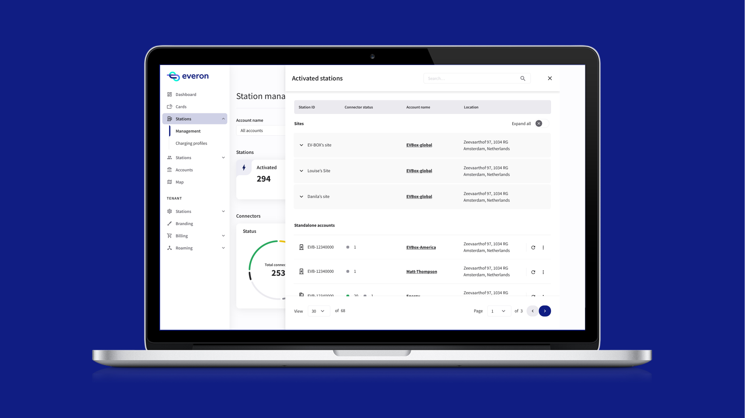
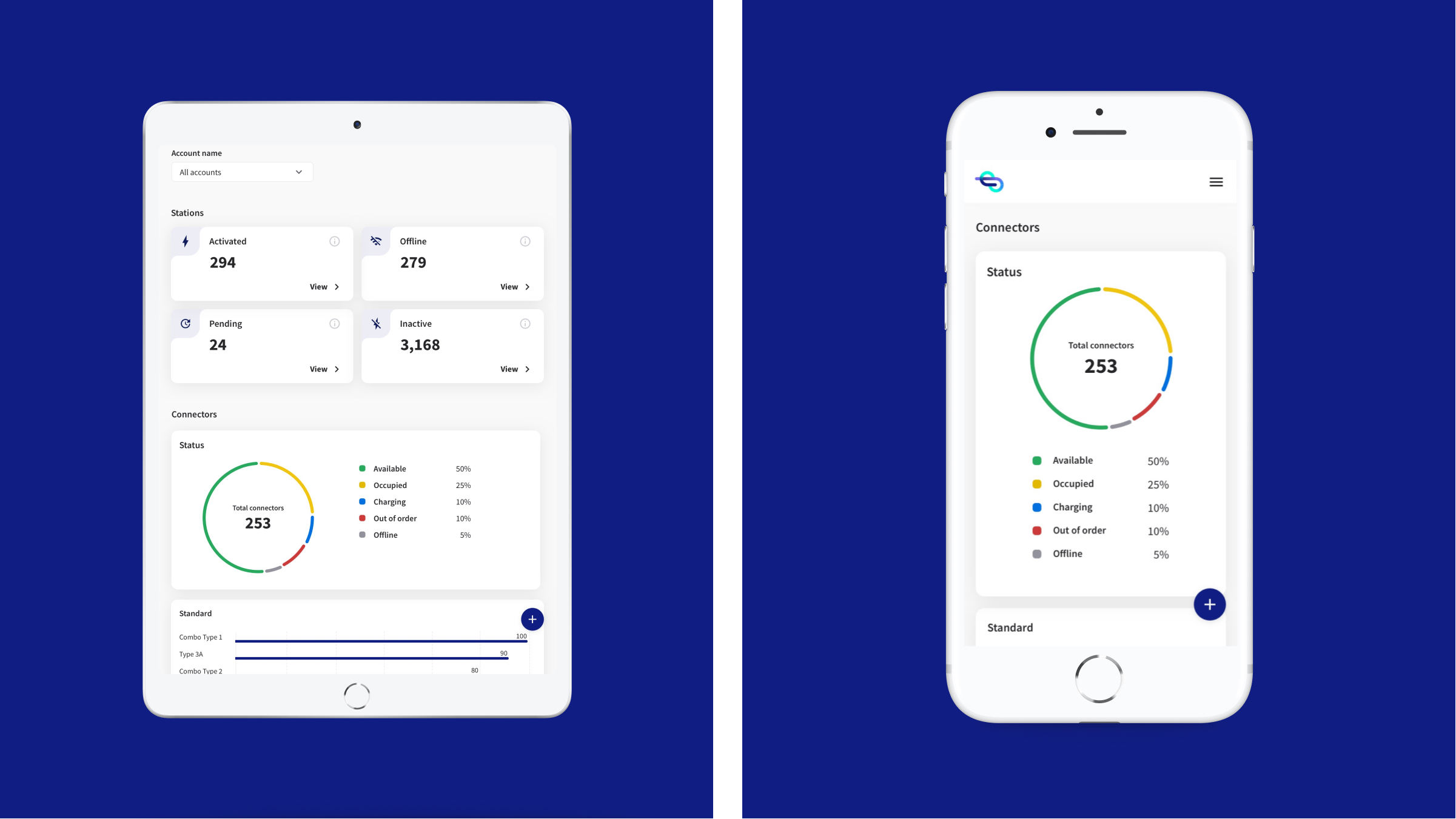
Snapshot cards, a searchable and filterable station list, CSV export, and a responsive layout — the pieces of the MVP that shipped.
“The dashboard allows us to find stations quicker and have a clear overview of the out-of-order connectors — and therefore the state of a site. The stations are also organised in a logical way, so we can understand where a station is in the workflow. That wasn't possible before.”
Second-line support team, after rollout.
“Before, a customer would call and we'd start digging through systems. Now I open the account and the answer is already on the screen — it's changed how we start every conversation.”
Support agent, three months in.
When Daniela first came to Everon, we were a small design team and had been trying to move forward with our design system for about a year. She came in and revolutionized how we were documenting the design system and got us on the right path. She started powering through with great dedication and attention to detail. She's also lovely to work with as a colleague and always looked forward to working together on projects. I highly recommend Daniela!
I could work very closely to Daniela at Everon, which we were able to contribute to projects as Design System and more business guided as stations management. She is an outstanding designer who dive-in the business along with her product pair and goes straight to the point. She is humble, honest and very fun to work with. She is definitely a strong player on any product and design team.